Mid-Century Modern: The Design Trend that Never Fades
 Nov, 4 2023
The Birth of a Timeless Trend
Ever wondered why there's something so endlessly charming about clean lines, simple forms, and a subtlety of details? Truth is, charm is an ageless appeal, whether it be in the world of fashion, architecture, or interior design. While sipping my morning coffee, with my Golden retriever Zoe lounging next to me, I've pondered about one such timeless charm – the Mid-Century Modern design trend. Named as such not because it's a specialty of the middle ages or anything (Oliver, my Maine Coon cat, gives me a disparaging look as if he knew it already) but because this style practically defined the aesthetic of the mid-20th century, specifically from 1930s to the late 60s. And yet, here we are, well into the second decade of the 21st century and this design trend simply refuses to become passé. So what's the magic?
Unraveling the Aesthetics
Begin with the basics, I'd say. At the heart of Mid-Century Modern (let's call it MCM for convenience) lies an impossibly simple doctrine: Form follows function. And what that translates into is, put every design element to work. Nothing in your space should merely be a showpiece, looking pretty but serving no purpose. I once had a beautiful yet utterly uncomfortable wooden stool – an alleged MCM piece. I turned it into a plant stand. It looked even prettier, and this way, it served a function too. Oliver has since claimed it as his personal jungle gym. No complaints there.
The hallmark of MCM is simplicity and functionality without sacrificing style or aesthetic appeal. The designs feel effortlessly elegant, with clean lines, gentle organic curves and a mix of different materials. That being said, MCM is not about stuffing your space with vintage pieces from the 50s or 60s. Trust me, even Zoe would frown upon that. It’s about capturing the ethos of the era, not necessarily the catalog.
I understand that this may sound a bit intimidating. It's something that's happened to me in the past. When I first moved to Melbourne, I was taken in by the chic boutiques and contemporary design shops lining the city streets. Their displays were always immaculate, a seamless blend of old and new. Yet, as much as I admired them, I also felt somewhat overwhelmed. It wasn't until I dived deep into learning about MCM that I began to understand the language of this trend.
Speak the Mid-Century Modern Lingo
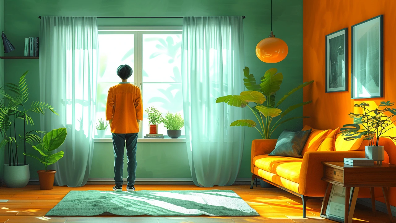
A big part of embracing the MCM charm is learning to identify its typical design elements and craftsmanship details. Let's start with some hallmark elements. The MCM color palette typically involves a contrast between neutral tones like beige, brown and white, and vibrant hues like orange, yellow, green, or pink. It's much like watching Oliver playfully contrast against my neutral-toned living room set, his vibrant ginger fur popping against the subtle beige upholstery.
Wood is a frequent player in MCM settings. But not just any wood. We are talking about high-quality, durable types like teak, walnut and rosewood. If you observe an MCM piece, you'd notice a certain level of mastery in the woodworking. Joints are often exposed, showing off the craftsmanship, and surfaces are typically polished to a high shine.
MCM designs also like to play with different materials. So you'd see wooden tables with tile inlays, or metallic lamp stands sporting paper shades, almost like the time when I decided to replace Zoe's worn out fabric leash with a leather one, perfectly contrasted with the metal clasp. Again, remember the ethos – functionality with style.
Injecting Mid-Century Modern into Your Life
Adopting the MCM style doesn’t mean giving your space a complete overhaul. Remember, everyone's style is personal and unique. Maybe your current space is full of Victorian era pieces, or traditional Chinese furniture, or just a comfy melange of everything you love, like mine was before my MCM awakening. A dash of MCM can seamlessly integrate into almost any style, much like how Oliver gets along with Zoe, even though a dog and a cat are quite different animals.
So you do not have to get rid of everything and start from scratch. I didn’t! I started small - a vintage-looking starburst clock here, an Eames-style chair there, a Noguchi coffee table to replace the old one. Gradually, I curated my space without it feeling forced or looking like a hastily compiled Pinterest board. The transformation was organic, almost like watching Oliver slowly grow from a fluffy kitten into the majestic Maine Coon cat he is today.
The key to infusing this style into your space helping it tell its story, your story. My space, for instance, is a melange of experiences, and personal artifacts, accented with MCM pieces, a testimony to my journey from a relatively clueless bloke about design, to an MCM admirer.
At the end of the day, remember, a design trend is more than just a pretty face. It's a living, breathing entity that interacts with the space and the people it inhabits. MCM, with its timeless charm, is like a good friend – it knows how to mingle, keep you comfortable, inspire you every day, and never feels out of place. Maybe that’s why it never really fades.