Proportion and Symmetry: Practical Ways to Boost Your Designs
Ever wondered why a building feels balanced or why a painting draws your eye? It’s the magic of proportion and symmetry. These two rules work together like a sturdy frame and a clear layout, making spaces feel right and visuals feel powerful. In this guide you’ll get straight‑to‑the‑point tips you can apply today, plus quick references to some of our most popular posts.
Why Proportion Matters in Every Project
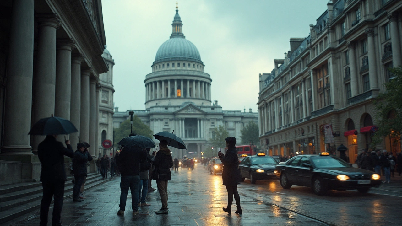
Proportion is the relationship between parts of a whole. Think of the Golden Ratio in a Renaissance façade or the simple 1:2:3 scale used in modern furniture. When the ratios feel natural, people instinctively trust the design. To check proportion, grab a ruler or a digital measuring tool and compare key elements: the height of a door to the width of a wall, the size of a logo to the background canvas, the depth of a room to its length. If the numbers line up with classic ratios (1:1, 1:1.618, 2:3) you’re on the right track.
Our post “Reviving the Renaissance: How Renaissance Architecture Shapes Modern Design Today” breaks down how architects used proportion to create harmony. Use its checklist: list primary dimensions, apply a ratio, and adjust until the visual weight feels even.
Symmetry in Modern Design – When to Use It and When to Break It
Symmetry is the mirror image of one side onto the other. It’s why a perfectly centered doorway feels stable and why a balanced composition feels soothing. You can apply three basic types: bilateral (left‑right), radial (around a center point), and translational (repeating patterns). For a quick test, fold a printed layout in half – if the halves line up, you’ve got symmetry.
But perfect symmetry can also feel boring. That’s where intentional breaks come in. In “Pushing the Envelope with Deconstructivism,” we show how designers keep the eye moving by offsetting parts while still respecting an underlying rhythm. Try this: start with a symmetric grid, then shift one element a few centimeters off‑center. The result feels dynamic without losing balance.
Here’s a fast workflow you can copy:
- Lay out your main elements on a grid.
- Check if each side mirrors the other (use Photoshop guides or Sketch columns).
- Pick one element to offset – change size, color, or position.
- Step back and ask: does the piece still feel organized? If yes, you’ve added interest without chaos.
Want more examples? Look at “American Craftsman Design: History, Key Features, and Timeless Appeal” for classic symmetry, and “Neo‑Futurism: What Is Neo‑Futurism? Principles, Examples, and a Practical Design Guide for 2025” for modern asymmetrical twists.
Bottom line: use proportion to set a solid foundation, then layer symmetry to guide the viewer’s eye. When you feel stuck, pull out one of our checklists, adjust a ratio, or shift a single element. In minutes you’ll turn a flat layout into a design that feels both stable and alive.
How Renaissance Architecture Shapes Modern Design and Cities Today
What survives from Renaissance architecture today? Clear principles, modern examples, and a cheat sheet to spot it in buildings, squares, and skylines.
Read more