How Renaissance Architecture Shapes Modern Design and Cities Today
 Sep, 20 2025
If your city square frames a fountain and a city hall on a clean axis, you’re seeing a 500-year-old idea at work. The promise here is simple: understand how a style born in 15th‑century Italy still guides the buildings we use, the streets we walk, and the software that designs them. Expect practical cues to spot the influence fast, plain-English principles you can apply, and credible examples-without the jargon.
- TL;DR: The Renaissance gave us a reusable toolkit-symmetry, clear geometry, human-scaled proportions, and a shared “language” of columns and pediments-that still shapes modern buildings and city plans.
- Want to identify it fast? Look for balance around a center line, repeated bays, rhythmic windows, and simple ratios like 1:1, 2:3, 3:5 used in plans and facades.
- It’s not just pretty: these rules improve clarity, wayfinding, daylight, and construction efficiency, and they scale well-from houses to civic squares.
- Today’s tech-BIM and parametric tools-makes Renaissance proportioning easier to use at speed, not obsolete.
- Use the cheat sheet below to read your city, plan a renovation, or study for studio crits and exams.
The Renaissance Blueprint That Still Runs the Show
Strip away ornate molding and famous domes, and what’s left is the enduring core of Renaissance architecture: a calm, legible order that starts with the human body and simple geometry. Designers in Florence and beyond drew from ancient Rome but refined the recipe: clear grids, balanced facades, and rooms laid out by whole-number ratios instead of guesswork. That playbook still works because it solves timeless problems-how to make complex places feel understandable, repeatable, and pleasant to use.
Four anchors carry over into today:
- Proportion and symmetry: not perfection for its own sake, but a way to build calm, predictable rhythm. In practice, that means matching window heights across floors, aligning edges, and keeping a stable center line.
- Geometry as structure: circles, squares, and rectangles act like a design grid. They make parts fit and help builders coordinate across trades.
- A shared visual language: columns (even thin, modern ones), pediments, cornices, and arcs. Whether stripped down or classical, they act like road signs for the eye.
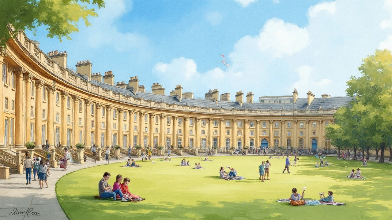
- Urban rooms: a square or courtyard framed by well‑proportioned edges, often with a focal element-fountain, statue, or civic building-anchoring the space.
Why it’s still here: it scales. You can apply the same ratio from a doorknob to a district plan. Leon Battista Alberti argued this in De re aedificatoria (1452): make the parts fit the whole, and the whole will feel right. Andrea Palladio turned that into a handbook in I quattro libri dell’architettura (1570), laying out room modules, column spacings, and facade rhythms that traveled across centuries. Architects still study these books, not to copy details, but to borrow the method.
Today’s twist: software makes the ratios agile. Parametric tools let you set a module-say, a 1.2 m grid-then push and pull forms while keeping alignments and proportions intact. It’s the Renaissance habit, now with a slider.
How to Spot Renaissance DNA in Modern Buildings and Cities
Here’s a quick, street‑level way to read a building or square for Renaissance traits. Think of it as a decision tree you can run in under a minute.
- Is the facade symmetrical around a clear center line?
- Yes: Go to step 2.
- No: Scan for near-symmetry-balanced massing even if details vary. Many contemporary projects keep the balance without perfect mirroring.
- Do you see a repeated module (bays) that sets rhythm-like evenly spaced windows or columns/pilasters?
- Yes: Count one bay’s width. See if it repeats like a beat. That’s the Renaissance grid in disguise.
- No: Move to step 3.
- Are there classical cues-pediments, cornices, arches, or a base-middle-top composition?
- Yes: They can be minimal (a crisp overhang can stand in for a cornice). The “base-middle-top” often maps to ground floor, repeated floors, and a defined roofline.
- No: Check the plan or plaza. The influence often hides in layout rather than surface details.
- Does the plan rely on simple ratios?
- Clue: rooms whose lengths relate as 1:1, 2:3, or 3:5; squares and rectangles nested; a dome on a square base.
- In the public realm, is there a framed “urban room” with a center-fountain, monument, or civic front-and clear edges?
- Clue: a square where buildings are of similar height, corners are closed, and the eye finds a focal point from most approaches.
Field heuristics you can trust:
- Window math: measure by eye the ratio of height to width. If it feels closer to 3:5 than, say, 1:2, you’re in Renaissance territory.
- Order without opulence: even a bare concrete facade can be “classical” if it reads as base-middle-top and holds a rhythm.
- Axial walk: stand at one end of a square or gallery; if a central element “locks in” as you move, that’s deliberate alignment.
- Human scale: railings at hand height, steps with consistent risers, and doors that don’t dwarf you-signals that proportions were tuned to the body.
Pitfalls to avoid when identifying:
- Don’t equate “old” with Renaissance. Gothic loves vertical emphasis and pointed arches; Renaissance prefers round arches and flat entablatures.
- Don’t assume “glass and steel” means no classical lineage. Many modern civic buildings hide a perfect symmetry and strict grid behind glass.
- Golden ratio myths: Renaissance designers used it sometimes, but they relied more on simple whole-number ratios. If you see 1:1, 2:3, 3:5, that’s more historically likely.
Why this matters for practitioners: these rules lower risk. Rhythm and modules speed up coordination, reduce custom parts, and help with code-driven regularity (think egress spacing, daylight targets, and span efficiency). For the public, it’s about legibility-spaces that explain themselves without a map.
Case Studies and Comparisons: From Piazzas to Parametrics
A quick tour, from classic to contemporary, showing how Renaissance logic lives on:
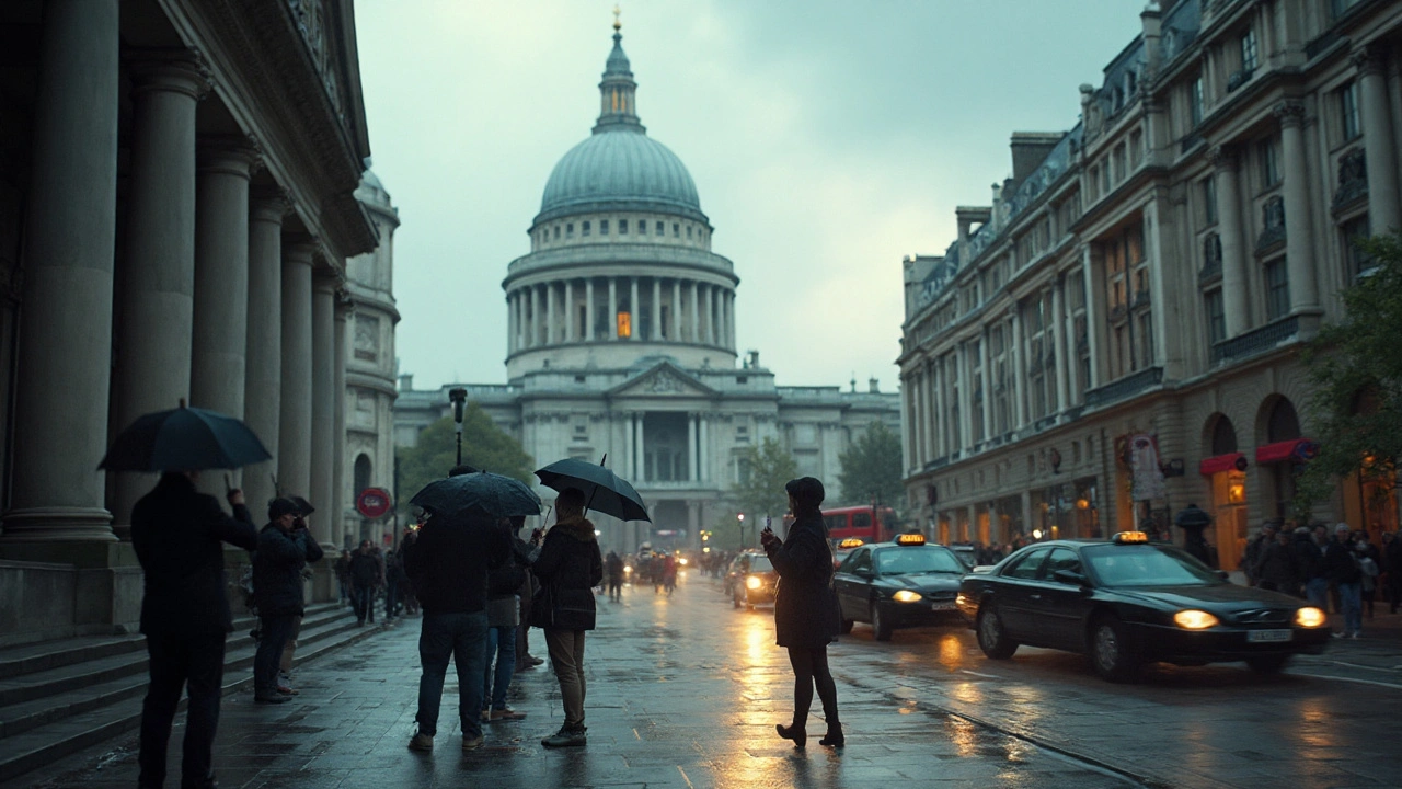
- Urban squares: Florence’s Piazza della Santissima Annunziata sets the template-colonnades form edges, a central axis frames a church, and twin facades keep balance. Today, many new town centers mimic this with consistent cornice lines and focal elements. Even when materials change, the “urban room” idea holds.
- Palladian echo: Palladio’s villas spread a clear grammar of center halls, proportional rooms, and temple‑fronted facades. Fast forward, and you’ll see their descendants in countless civic buildings with a strong central portico and balanced wings. The visual lineage is direct, even when the details are abstracted.
- Modern minimalism with classical bones: Think museums and libraries with glass walls but a rigid grid, exact symmetry, and a pronounced roof edge. The vocabulary is new; the sentence structure is old.
- Retail and transit: Many flagship stores and stations rely on an arch-and-bay system to scale large spaces to human experience. You feel grounded because the rhythm is readable.
To make this concrete, use the table below as a translator between periods:
| Principle | Renaissance source | Modern translation | Where you’ll see it |
|---|---|---|---|
| Proportional modules | Alberti, De re aedificatoria (1452) | Modular grids in BIM; consistent bay spacing for structure and facade | Office towers with repeating window bays; housing blocks with standard spans |
| Symmetry and axis | Palladio, I quattro libri (1570) | Central lobbies; aligned circulation; major-minor axis planning | Government buildings; campuses with quads and axial walks |
| Classical vocabulary | Vitruvius revived via Renaissance treatises | Abstracted pediments and cornices; expressed base-middle-top | Courthouses, libraries, and restrained contemporary civic architecture |
| Urban rooms (piazzas) | Italian piazza tradition refined 15th-16th c. | Framed squares; mixed-use edges; focal elements that anchor views | New town centers; university quads; redevelopment plazas |
| Human scale | Anthropometry embedded in Renaissance design | Consistent stair risers; railing heights; door and window proportions | Residential retrofits; code-compliant, comfortable public buildings |
Credible references if you want to go to the source: Alberti’s De re aedificatoria sets out proportion and harmony as first principles; Palladio’s I quattro libri turns that into buildable diagrams; Vitruvius’s De Architectura is the ancient text the Renaissance re-read and adapted. For urban context, UNESCO’s 2011 Recommendation on the Historic Urban Landscape explains how to keep historic patterns legible while updating cities.
A note from personal experience: in Ottawa, a stroll from Parliament Hill down to the civic squares shows how much balance and axis still guide the experience, even when the styles shift. You can feel the calm of proportion long before you name it.
Why this travels across cultures: the method is portable. You don’t need a Roman column to be “Renaissance.” You need parts that fit together in a way the body understands-regular steps, aligned edges, clear centers, and a rhythm your eye can count. That’s why these ideas show up in places with very different materials and traditions.
Cheat Sheets, Examples, FAQ, and Next Steps
Here’s the practical toolkit you can carry into a site walk, a studio review, or a home project.
Quick checklist to spot Renaissance legacy:
- Facade reads as base-middle-top? You’ve likely got classical structure, even without ornament.
- Windows line up horizontally and vertically? That’s a module at work.
- Plan uses simple room ratios (1:1, 2:3, 3:5)? Classic Renaissance method.
- Public space framed on all sides with a clear centerpiece? That’s the piazza idea, modernized.
- Big building, small parts: can you “count” the bays across a wide facade? Human scale inside a large mass.
Rules of thumb when designing or renovating:
- Pick a module and stick to it. Start with a practical dimension (e.g., 1.2 m or 4 ft) tied to materials and structure. Let doors, windows, and rooms snap to it.
- Tune ratios before details. Get the plan feeling right with 1:1, 2:3, or 3:5 rooms. Details on top won’t fix a plan that fights itself.
- Express the base. A subtle change in material or a stronger sill line at the ground floor instantly clarifies a facade.
- Center with purpose. If you choose symmetry, put something worth centering-an entry, a stair, or a view.
- Let daylight and structure confirm the grid. Align columns with window rhythm to avoid expensive clashes.
Common mistakes and how to avoid them:
- Fake symmetry: mirroring everything can make egress, services, or energy performance worse. Keep the facade calm; let the plan be smart.
- Ornament without order: a pediment over a door won’t help if the window rhythm is irregular. Fix the bones first.
- Historic pastiche: copying details at random rarely works. Translate the proportions to modern materials; skip what doesn’t fit the program.
Examples you can study today (in person or via drawings and photos):
- Any central courtyard building that reads as a square or rectangle with a clear center-watch how the circulation loops around the void.
- Libraries and museums with clear symmetry and a defined top edge-count the bays and note how the roofline ties it together.
- Town squares with matched cornice heights-stand in a corner and see how the edges hold the space like walls of a room.
Mini‑FAQ
- Is the golden ratio the secret behind every elegant building? No. Renaissance designers more often used simple whole-number ratios. Golden ratio claims are overplayed.
- Can glass-and-steel buildings be “Renaissance” in spirit? Yes, if they use symmetry, modular rhythm, and a legible base-middle-top structure.
- What’s the difference between Renaissance and Neoclassical? Neoclassical revives ancient forms again in the 18th-19th centuries, often at larger civic scale. The grammar overlaps, but materials and context differ.
- Does sustainability conflict with classical order? Not inherently. A regular grid can cut material waste, simplify daylighting patterns, and streamline prefabrication.
- Where can I read primary sources? Alberti’s De re aedificatoria, Palladio’s I quattro libri, and Vitruvius’s De Architectura are the big three. Many translations are available.
Cheat sheet you can screenshot
- Ratios to trust: 1:1 (square), 2:3 (calm rectangle), 3:5 (more elongated, still stable).
- Sequence that works: set module → align structure → place openings → tune facade → add detail.
- Urban rule: enclose three sides clearly; give the fourth a focal object or view.
- Symmetry tip: keep the big moves symmetric; let the small stuff (mechanicals, service rooms) go where they need.
Next steps and troubleshooting for different people
- Homeowners planning a renovation
- Next step: pick a module tied to your framing (e.g., 16 in on center) and let window sizes and cabinet runs follow. Aim for 2:3 proportioned rooms for living areas.
- Watch out for: one-off window sizes and misaligned edges that raise costs. Align sills and heads where possible.
- Architecture students and educators
- Next step: redraw a favorite plan using whole-number ratios. Then test variations in a parametric model to see what breaks legibility.
- Watch out for: chasing ornament before structure. In crits, explain your module first; details second.
- Urban planners and city builders
- Next step: ensure new squares have consistent edge heights and corners that close. Give each square a clear “front” and an anchor (view, monument, or civic door).
- Watch out for: oversized setbacks that dissolve the room; podiums that don’t read as a base.
- Design-curious travelers
- Next step: when you reach a plaza or campus quad, stand at center, then at each corner. Notice how the space holds together from different points-that’s proportion at work.
- Watch out for: mistaking surface style for structure. Read the plan and the rhythm; ignore the material for a moment.
Why this still feels fresh in 2025: the problems haven’t changed. We still need buildings that explain themselves and public spaces that make people want to linger. The Renaissance gave us a method that’s friendly to change-swap materials, update technology, keep the proportions. When you spot that calm, centered order on your next walk, you’ll understand why it keeps returning: it works.