Symmetry and Order: Why Balance Shapes Art & Architecture
Ever wonder why a building feels right or a painting feels calm? It’s usually because the creator used symmetry and order. Those two ideas are like a hidden rulebook for designers. When shapes line up, our brain says, “That looks good.” This page shows how you can notice that rule in the world around you and even use it yourself.
Seeing Symmetry in Everyday Design
Step outside and look at a classic house. The windows on each side of the door match, the roof slopes are the same on both ends, and the columns stand in even rows. That’s symmetry at work. It’s not just old houses—modern homes use the same trick. Think of a high‑tech apartment with a glass facade. The panels are arranged in a grid, giving a clean, ordered feel.
In art, the principle is just as clear. A Renaissance portrait often has the subject centered, with shoulders and background elements mirrored on each side. Even street art can follow the rule: a mural might split a wall into two equal halves, each half reflecting the other. Spotting these patterns helps you appreciate why a piece feels balanced.
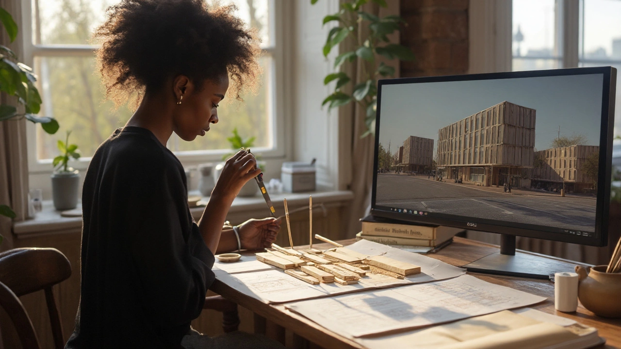
Creating Order in Your Own Projects
If you’re designing a room, start by choosing a focal point—maybe a sofa or a piece of art. Then place matching items on either side: a lamp on the left, a plant on the right. Keep the spacing consistent. The result feels calm, and you won’t have to chase a chaotic look.
When drawing or painting, sketch a simple grid first. Use it to line up major elements. Even if you later break the grid for drama, the viewer’s eye still reads the underlying order. This technique works for graphic design too—think of a website header where the logo sits in the center and navigation links balance on each side.
Architecture students love these ideas because they’re easy to test. Try sketching a building façade using three equal columns. Measure the gaps, keep the heights the same, and you’ll see a sense of stability instantly. If something feels off, tweak the measurements until the symmetry clicks.
Symmetry isn’t a rule that must never be broken. In fact, the most exciting designs often mix order with a surprise element—like a single window that’s a different size or a color splash on an otherwise uniform wall. That contrast makes the ordered parts stand out even more.
So next time you walk by a museum, glance at the building’s outline. Notice how arches line up, how columns repeat, and how the overall shape feels balanced. When you understand the language of symmetry and order, you’ll start to see design choices that you never noticed before, and you’ll be ready to use them in your own creative work.
Reviving the Renaissance: How Renaissance Architecture Shapes Modern Design Today
A clear, practical guide to how Renaissance ideas-proportion, symmetry, order-shape modern architecture, with examples, checklists, and step-by-step tips.
Read more