Revivalism in Graphic Design: Why Old Styles Feel Fresh Again
Ever wonder why a poster looks like it came from the 1920s, or why a logo feels like a medieval coat of arms? That’s revivalism at work. Designers pick a past visual language, remix it, and give it a modern twist. The result feels familiar, yet new enough to catch eyes.
Revivalism isn’t a new idea. Artists have always looked back for inspiration. In graphic design, the trend shows up as a deliberate nod to a specific era—Art Deco, Swiss modernism, or even Victorian ornamentation. By borrowing these styles, designers tap into the emotions and cultural meanings attached to the original period.
How to Spot a Revival Trend
First, look for signature elements: bold geometry for Art Deco, clean grids for Swiss style, hand‑drawn serifs for Victorian work. Next, notice the color palette. Past palettes often use limited, muted tones, while modern revivals might add a pop of neon for contrast. Finally, check the layout. Old‑school layouts tend to be more symmetrical; a revived version may keep that balance but use digital tools for sharper execution.
For example, the recent wave of music festival posters mixes 1970s psychedelic swirls with today's flat‑color vectors. The result feels retro and instantly shareable on social media. Another case is branding for craft breweries that lean on 19th‑century typography, giving their bottles a heritage feel that appeals to modern consumers.
Practical Tips to Use Revivalism in Your Projects
1. Pick a era that matches the story you want to tell. A tech startup might borrow Bauhaus minimalism to signal efficiency, while a boutique hotel could use Art Nouveau curves to suggest elegance.
2. Study original pieces. Look at old posters, book covers, or print ads. Notice the spacing, the line weight, and the way images interact with text. This research saves you from copying blindly.
3. Blend, don’t clone. Take one or two defining traits—like a specific typeface or pattern—and pair them with contemporary layouts or photography. This keeps the design fresh.
4. Test with your audience. Show a draft to a few people and ask what era it reminds them of. Their feedback will tell you if the revival vibe is clear.
5. Keep accessibility in mind. Some vintage fonts are hard to read at small sizes. Adjust spacing or choose a modern backup font for body copy.
Using revivalism also helps you stand out in a crowded market. While many designers chase the latest digital effect, a well‑executed throwback can make a brand memorable. Just remember that the goal isn’t to imitate history perfectly, but to capture its spirit and make it work for today’s audience.
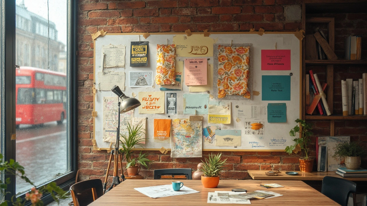
Ready to try it? Start by picking a style you love, gather a mood board of historic examples, and sketch a few layouts that mix old and new. You’ll see how quickly the past can become a fresh source of ideas.
Revivalism in graphic design proves that looking back is a smart way to move forward. When you understand the visual language of a past era, you can speak to today’s viewers with a voice that feels both trusted and exciting.
Revivalism in Graphic Design: Why Nostalgia Works and How to Use It
Why nostalgic design keeps winning, which eras to borrow from, and how to apply them without looking dated. Practical steps, style recipes, pitfalls, and a quick checklist.
Read more