Design Principles: How to Make Art and Architecture Work
Good design isn’t decoration. It’s a set of choices that decide whether a space feels calm, exciting, or awkward. Want a quick win? Start by thinking about balance and function before color or ornament. This page gives clear, usable rules you can apply to homes, buildings, interiors, or even product screens.
Core principles that actually change how things feel
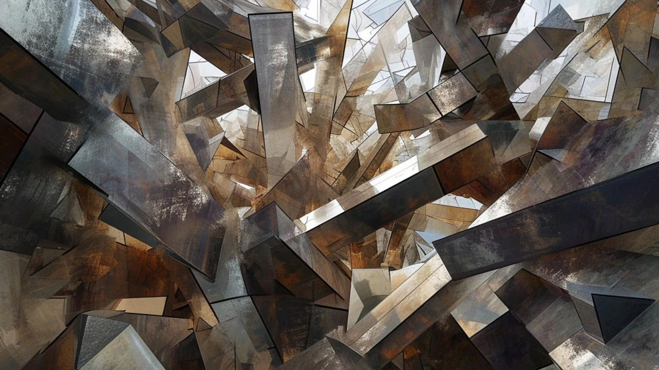
Balance: Distribute visual weight. A heavy stone wall on one side needs a counterpoint—a window, a lighter material, or a piece of furniture. Symmetrical balance feels formal (think Greek Revival columns). Asymmetry feels modern and lively (think many Postmodern facades).
Proportion & scale: Size matters. Proportion is the relationship between parts; scale is how those parts relate to human size. A giant column can awe, but in a small room it will feel wrong. Use human scale as your baseline: door height, seat height, and clear sightlines tell you what’s right.
Contrast & hierarchy: Make important things stand out. Contrast can be light vs dark, smooth vs rough, or simple vs ornate. Use hierarchy to guide the eye—entryways, focal walls, or main circulation paths should be clearer than background details.
Rhythm & repetition: Repeat shapes, materials, or spacing to create rhythm. Repetition ties a design together; small shifts keep it interesting. Think of window spacing on a Georgian facade or repeated arches in Roman architecture.
Unity & variety: Unity makes a design feel cohesive; variety keeps it from being boring. Pick a small palette of materials and introduce one unexpected element—a bold color or an ornate detail—to add character without chaos.
How to use these ideas right now
Start with function: List what a space must do. A living room needs seating, sightlines to a view or TV, and good flow. Arrange elements to support those needs first, then shape proportion and balance around that layout.
Test scale with tape or boxes: Before buying big furniture or adding a new wall, mock it up with tape on the floor or cardboard boxes. You’ll spot scale problems fast and avoid costly changes later.
Pick one focal point per room or elevation. If the facade has a strong entry, keep other features quieter. If you want drama inside, use a single bold piece of furniture or a textured wall instead of multiple competing accents.
Learn from styles but don’t copy blindly. Ancient Roman arches teach you why curves carry loads; Gothic verticality shows how light and height affect emotion; Minimalism teaches restraint. Check out examples across styles to see how these principles get used in real projects.
Finally, iterate. Sketch, test, and change. Design principles are rules of thumb, not rigid laws. Use them as a toolkit: mix balance with asymmetry, scale with intimacy, and function with flair to make spaces that work and feel right.
Exploring Deconstructivism: Shifting Dynamics in Architectural Design
Deconstructivism in architecture is a movement that breaks away from conventional design norms, creating structures that are thought-provoking and avant-garde. This article delves into the principles of Deconstructivism, its history, and its impact on both the architectural world and our perception of space and form. By exploring prominent examples and considering the future of the movement, we gain insights into how it challenges and reshapes our understanding of architectural design.
Read more