Contrast in Art & Architecture: Why One Thing Grabs Your Eye
Ever notice a dark arch against a bright sky or a single ornate doorway on an otherwise plain facade? That instant pull is contrast at work. Contrast isn’t decoration — it’s a tool that artists and architects use to direct attention, create mood, and make buildings readable from a distance.
At its core, contrast is any clear difference that the eye can register quickly. That difference can be light versus dark, rough versus smooth, large versus small, detailed versus simple, or bright color against neutral tones. Each type of contrast has a different effect: light contrast often adds drama, color contrast gives energy, and scale contrast signals importance.
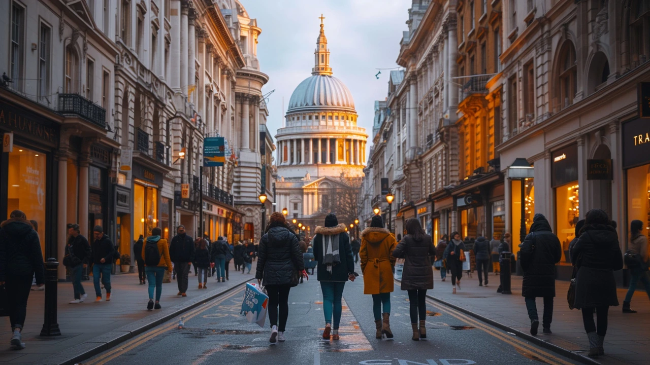
Look at Gothic Revival spires: the thin vertical lines stand against open sky and make the structure feel taller. Beaux‑Arts buildings use big, plain masses as a stage for ornament — the plain mass makes the carved details read louder. Minimalist architecture flips that idea: sparse surfaces push tiny accents to center stage. Historic styles like Byzantine mosaics rely on color contrast to make images read clearly from afar. Knowing these patterns helps you read a building the way a critic reads a painting.
How to use contrast in a project
Want contrast that actually works? Here are hands‑on tips you can use today.
1) Pick a primary contrast. Don’t mix too many different contrasts at once. Choose light/dark or color/value and stick with it to avoid visual chaos.
2) Use scale to mark importance. Make a main entrance larger or taller than surrounding windows to signal function without words.
3) Pair textures for tactile interest. Smooth concrete next to rough stone adds depth without color change — useful for neutral palettes.
4) Reserve bright color as an accent. A single colored door or painted cornice reads stronger than multiple scattered colors.
5) Control light intentionally. Shadows shape contrast every hour. Test how noon and evening light change your facade before final decisions.
How to spot contrast when you look
When you walk through a city, try this quick exercise: pick one building and name its dominant contrast — is it tone, texture, scale, or color? Then ask what that contrast tells you. Is the entrance inviting or imposing? Does the ornament shout or whisper? This habit trains your eye and makes travel or design research far more useful.
Photography tip: shoot the same subject at different times of day. Light shifts contrast more than paint or material does. A stone wall can read flat at noon and dramatic at sunset.
If you want more examples, check the posts tagged here — from Baroque drama to minimalist calm — and watch how contrast shapes each style. Try one small change in your own space: swap a doormat, repaint a trim, or add a textured panel. You’ll see contrast do the heavy lifting in how people notice and feel about a place.
Contrasting Constructivist Architecture with Other Architectural Styles
Oh boy, let's dive into the world of architecture, shall we? In the left corner, we've got Constructivist Architecture, known for its bold, abstract, and experimental design. And in the right corner, we have Other Architectural Styles, a vast group of varying aesthetics and principles. Constructivism, born from the 1920s Russian movement, is like a Picasso painting - you might not get it at first, but it sure does make a statement! Other styles, however, can range from the grandeur of Romanesque to the sleek lines of modernism. So, in this architectural royal rumble, whether you prefer the innovative Constructivism or other more traditional styles, there's certainly no shortage of design eye-candy for us all.
Read more