Architectural proportions: rules that make buildings feel right
Have you ever walked into a space that felt naturally balanced, then couldn’t say why? That ‘right’ feeling usually comes from good architectural proportions — the relationships between widths, heights, and depths that guide how we see and move through a building.
Proportions are not decoration. They shape structure, daylight, and comfort. When a doorway, window, or room follows a clear ratio, a building reads as calm and intentional. When proportions are off, spaces feel awkward no matter how nice the materials are.
Quick proportions to know
Here are simple ratios designers use again and again. None are rules you must follow blindly, but they’re handy tools.
- 1:1 — squares. Useful for rooms, tiles, and courtyards when you want stable symmetry.
- 1:2 — a tall rectangle. Common for doors and narrow windows.
- 2:3 and 3:5 — pleasing rectangles for windows, façades, and picture frames.
- Golden ratio (~1:1.618) — used in facades and compositions for a naturally pleasing balance.
- Human module — base measurements tied to the human body (eye height, reach, stride). A typical starting point is 1.8 m for overall scale.
Classical architects like Vitruvius and Palladio used clear modules—repeating units that make a building feel ordered. Modern designers such as Le Corbusier created the Modulor, a human-centered scale based on height and the golden ratio. Both approaches aim for spaces that feel right to people, not just to drawings.
How to apply proportions today
If you’re designing or renovating, try these quick moves:
- Pick one module. Base window heights, door widths, and ceiling bays on that single unit so parts relate to each other.
- Use the human scale. Make sure circulation paths and furniture layouts match how people move and stand. For example, set counter heights to reachable ranges (80–95 cm) and door widths to clear passage (80–90 cm for single doors).
- Test ratios visually. Draft a few façade options using 1:1, 2:3, and the golden ratio. Compare quickly — your eyes will tell you which feels balanced.
- Keep context in mind. A small house benefits from intimate proportions; civic buildings can use grander ratios to feel monumental.
- Measure old buildings. Take a tape and note repeating dimensions. Historic structures often hide clever proportional systems you can reuse as inspiration.
Proportions are simple to test and powerful in effect. Try measuring a door, a window, or a room and compare the numbers. Once you start noticing ratios, buildings will start to read more clearly — and you’ll find choices that make spaces work better for people.
Want examples? Look for classical works like Greek temples or Renaissance villas, and compare them with modern pieces that use the Modulor or grid systems. Seeing patterns across styles makes it easier to use proportions in your own projects.
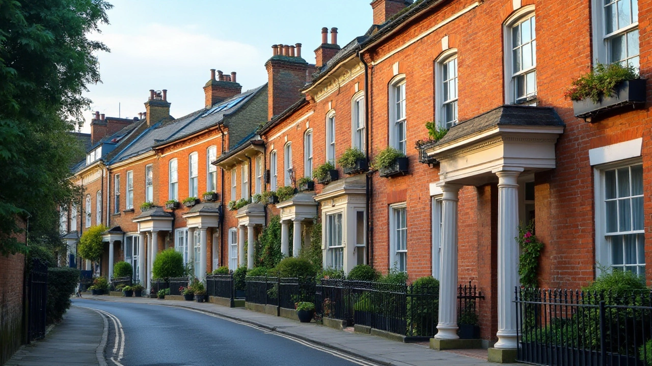
Exploring Georgian Architecture: A Study in Balanced Design
Georgian architecture, named after the British monarchs of the 18th and early 19th centuries, is celebrated for its emphasis on symmetry and proportions. This style, marked by its classic elegance and restrained decor, incorporates the harmonious use of mathematical ratios that reflect the ideals of the Enlightenment period. Through careful analysis of Georgian architectural elements such as windows, columns, and brickwork, we uncover the timeless appeal that continues to influence modern design today. This article provides an engaging exploration into the characteristics and enduring charm of Georgian architecture.
Read more